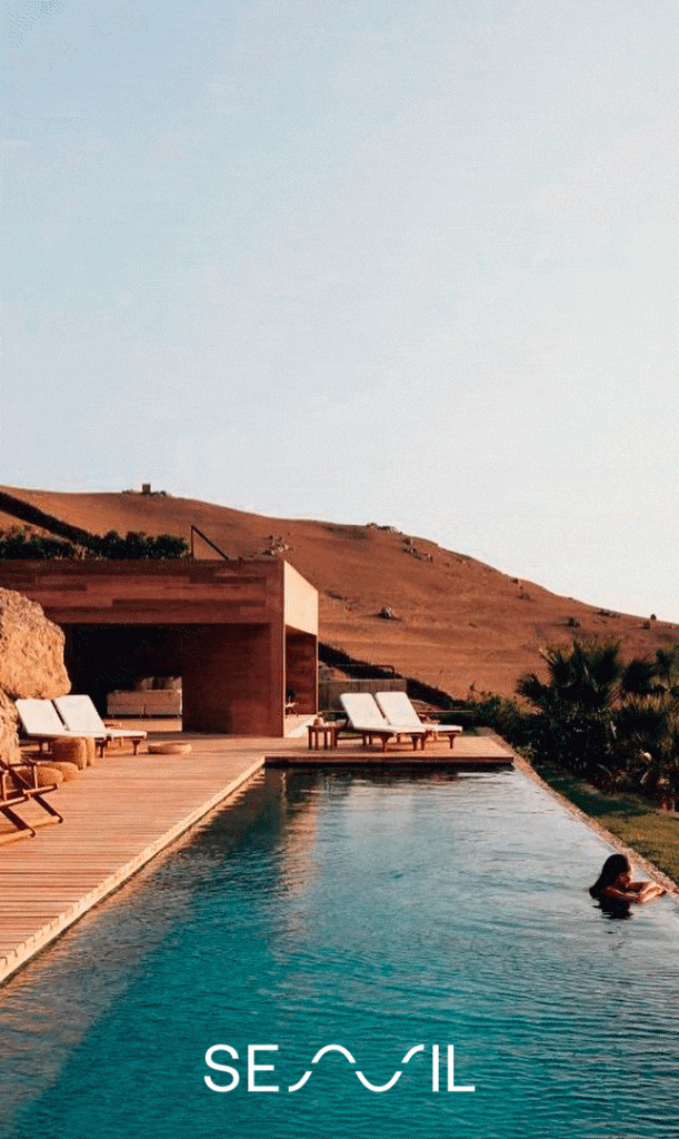
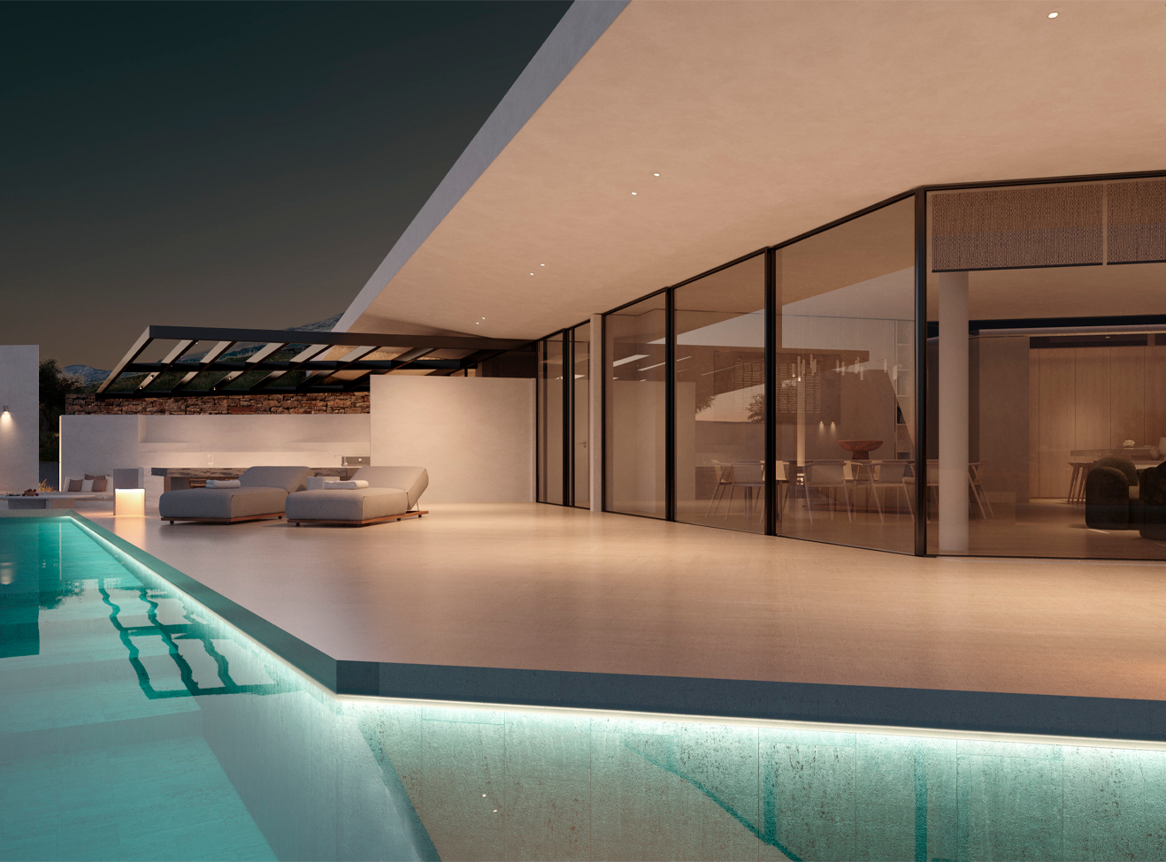
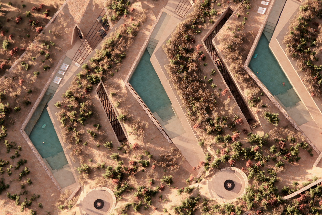
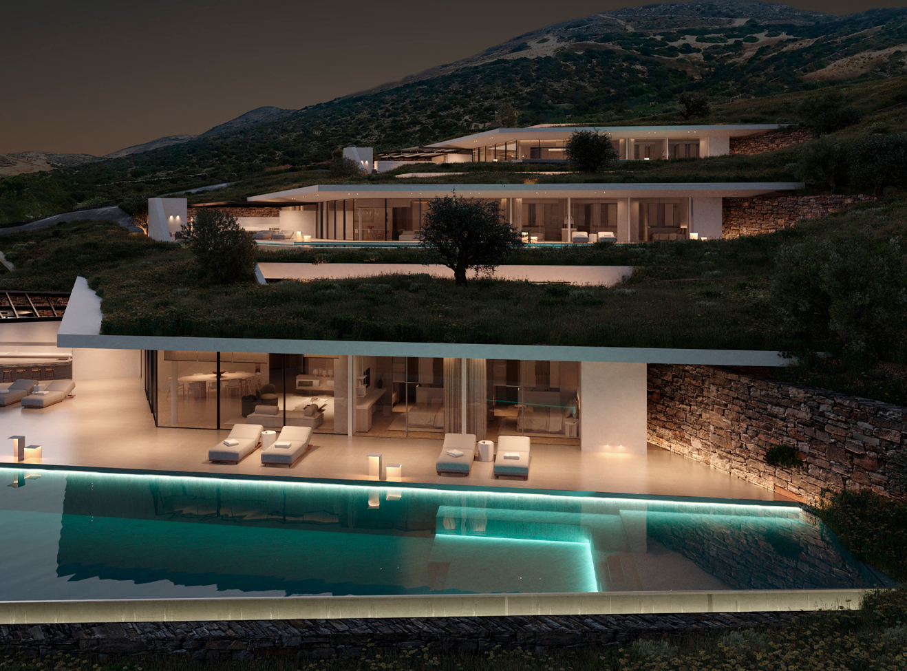
On the island of Paros, three villas carved into the hillside set the stage for a different kind of luxury. One that doesn’t shout but whispers. One that emerges from the earth, rather than being placed on it. We were invited to shape the soul of this project to create not just a name or an identity, but a complete brand universe that reflects the silence, harmony, and elemental purity of the landscape.
Through a process of deep strategic thinking and elegant design, we developed the full brand platform for SENIL: From brand development and positioning to naming and identity design. A brand that lives in the space between sky and sea, architecture and nature.
The Challenge
In-depth brand analysis
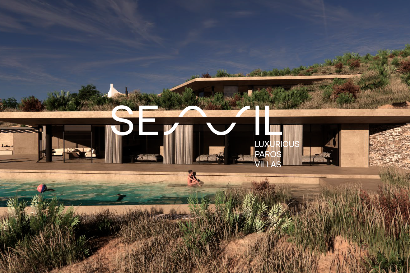
Three luxurious, cave-like villas designed to blend into the Parian landscape needed more than just a name and a logo. They needed a soul. We were asked to create a brand from the ground up one that reflects the raw beauty of the location, the purity of the materials, and the concept of “luxury simplicity.”
Our Approach
In-depth brand analysis
We began by conducting in-depth interviews with the founders to understand their vision, not just what they were building, but why. These qualitative insights shaped our understanding of the audience and guided the creation of the brand personality, tone of voice, and strategic positioning.
We studied the architectural presentation and collaborated closely with the architects to ensure the brand would become an extension of the space itself. Simultaneously, we researched similar projects in Greece and abroad, extracting learnings that would help position the brand as truly differentiated.
The Strategy
A philosophy carved in silence
The strategy behind SENIL was not just about defining a brand. It was about translating a way of living into a system of meaning. These villas were not meant to impress by standing out. They were designed to disappearto be absorbed by the landscape, to feel inevitable. That subtle yet powerful insight defined the brand’s entire architecture.
We anchored the brand on a singular idea: Lines.
Not just as a geometric element, but as a deeper metaphor.
- Lines that extend from hillside to horizon.
- Lines that shape the villas but also guide the senses.
- Lines that act as bridges between the visible and the invisible, the human and the natural, the silence outside and the stillness within.
In SENIL, the line is not decoration it is a flow.
It is movement without noise. It is architecture becoming topography.
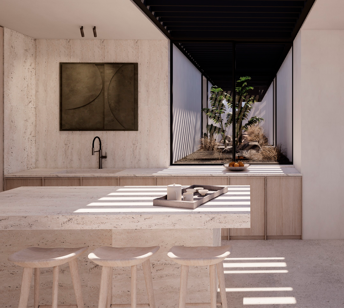
From the clean geometry of the villas to the tactile texture of the materials, everything is about continuity, rhythm, and balance.
The brand platform was built as an ecosystem of these lines: verbal, visual, spatial.
The tone of voice echoes this sense of restraint and fluidity.
The storytelling speaks in low volume but deep meaning.
And the entire experience, from naming to visual expression, creates a feeling of stillness in motion.
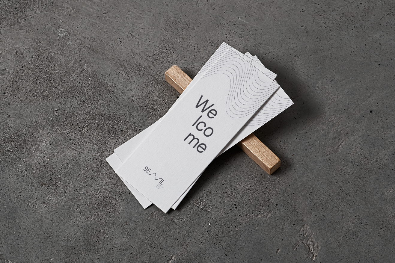
The Name
From geometry to essence
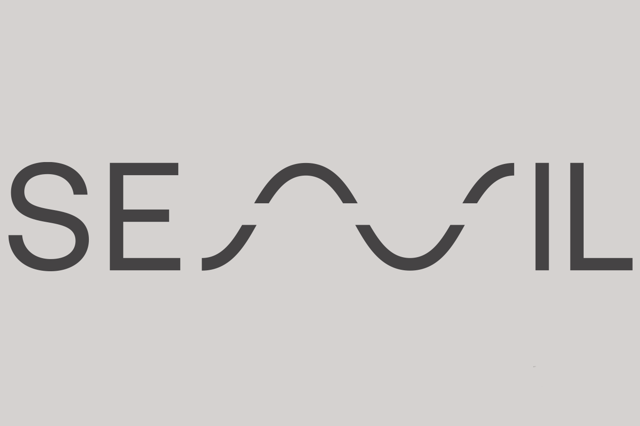
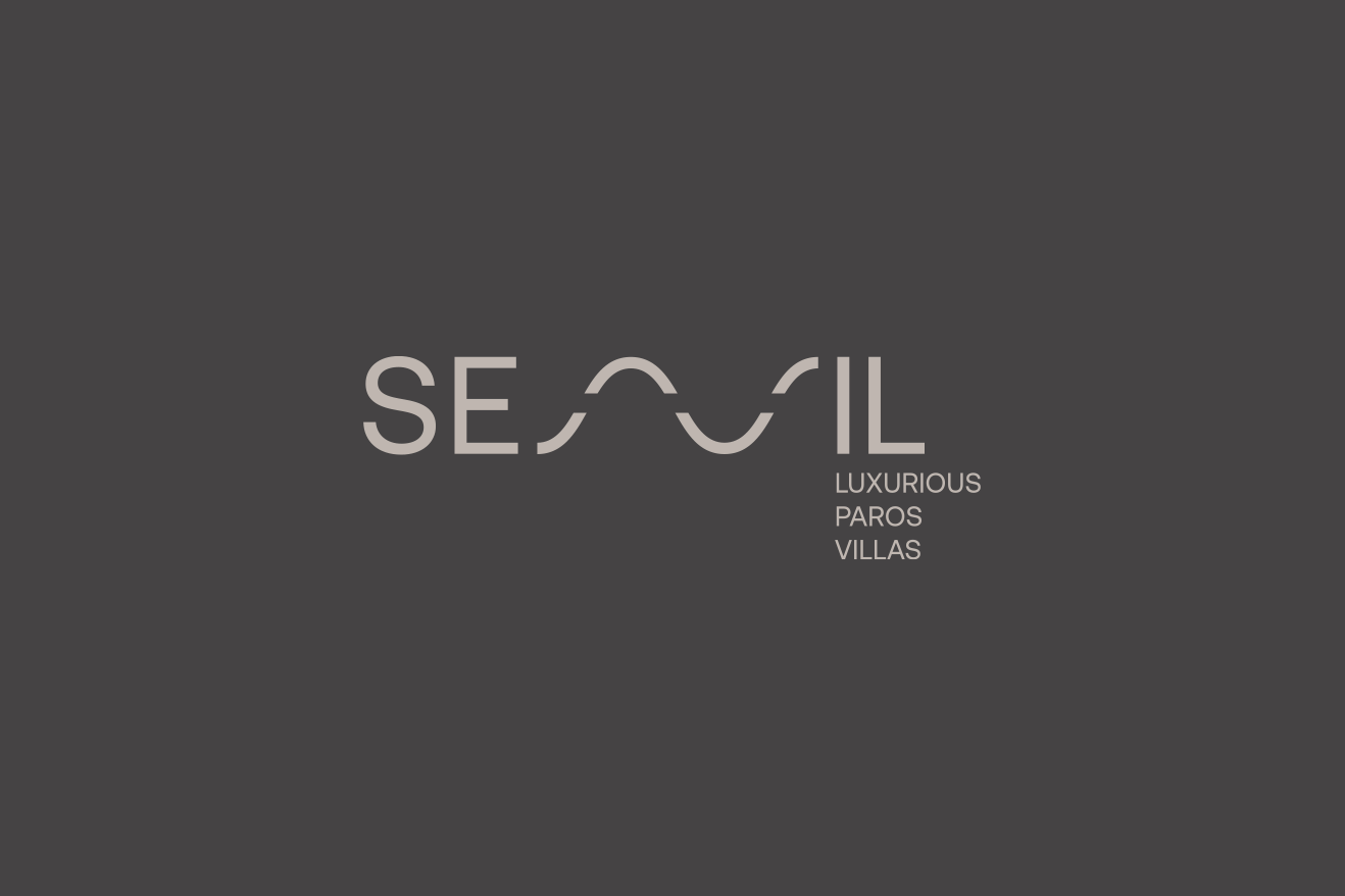
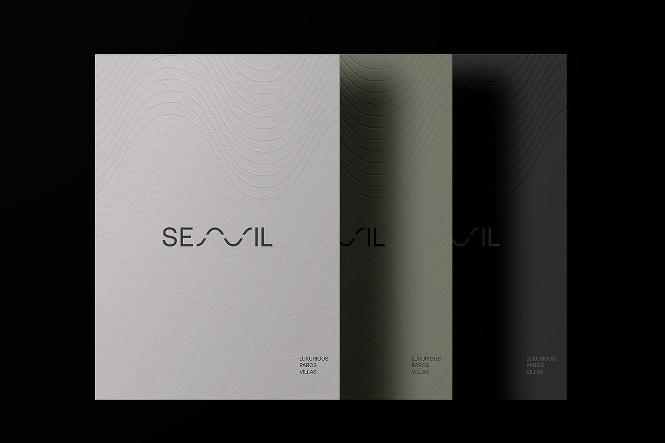
SENIL An elegant inversion of “lines,” SENIL reflects clarity, order, and organic beauty. It is soft, harmonious, and timeless. The name evokes the feeling of walking a horizon where the land, sea, and sky become one.
SENIL is not just a brand. It is a transition. From the noise of everyday life to the stillness of presence.
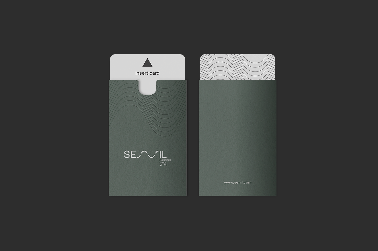


“At SENIL, design is not an aesthetic layer, it is an act of alignment. Every decision, from the way a shadow moves across a wall to the way a window frames the horizon, serves a single purpose to dissolve the boundaries between architecture and nature, material and meaning, silence and presence. We do not design to impress. We design to disappear, until what remains is balance, flow, and quiet immersion.”
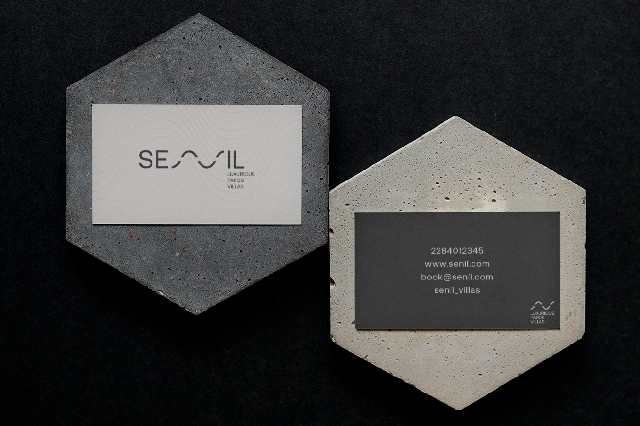
Brand Identity
Minimal by design. Meaningful by nature.
The identity reflects the purity of the villas’ architecture: linear, minimal, grounded. But beneath that simplicity lies a deeper design system, where form always follows intention.
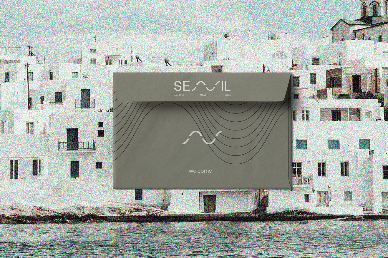
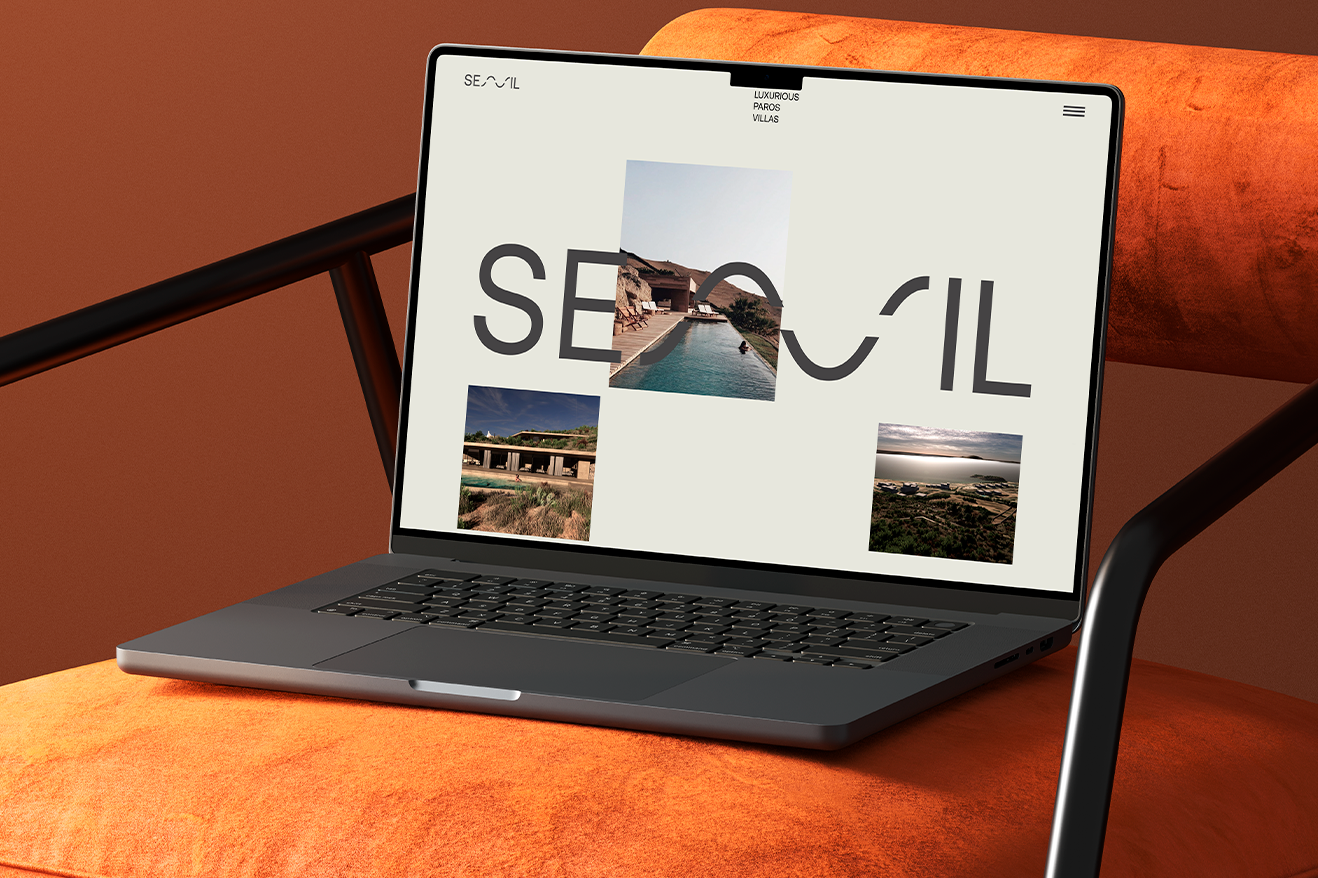
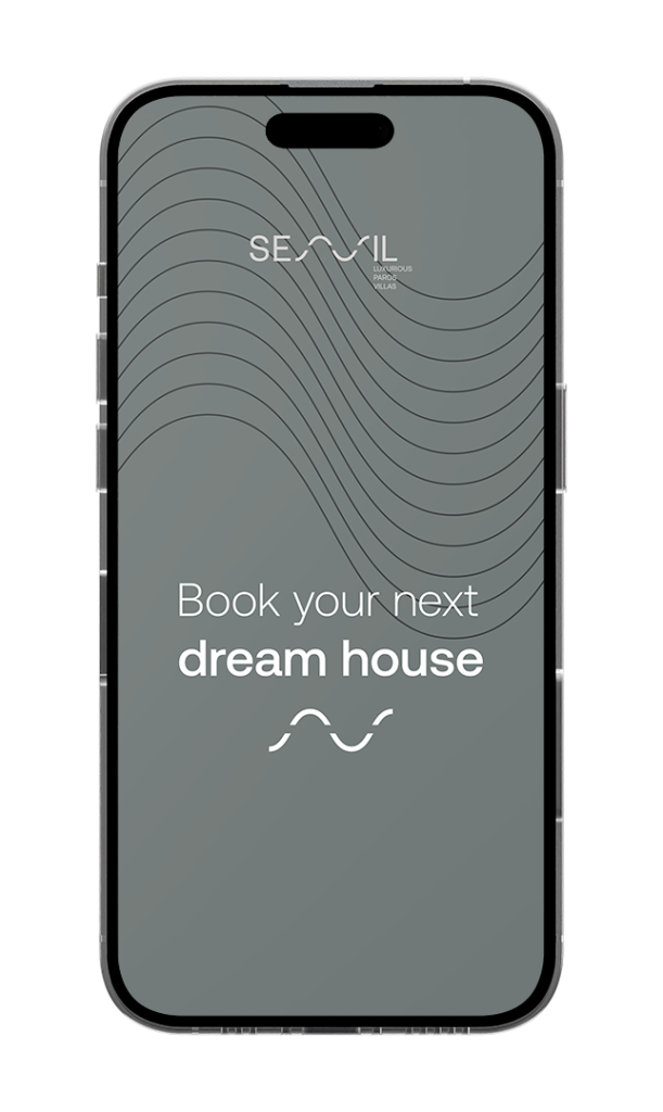
The logo is a distilled visual expression of the brand’s core values. The letter N in SENIL becomes a visual metaphor: a soft wave rising between two stable lines. It symbolizes the silent connection between the earth and the sky, a fluid gesture that mirrors the architectural rhythm of the villas themselves. Like a line in the sand carried by the wind, or a ripple in still water, it captures motion without disruption.
The typography is understated but carefully selected: quiet, confident, and spacious—echoing the generous proportions of the villas and their serene spatial experience.
The color palette is rooted in the natural tones of Paros: limestone, sand, soft stone, and light-diffused blues. No sharp contrasts. Only layers of harmony.
The graphic language is built around linear elements and framing devices that guide the eye without overwhelming it. Space and stillness are treated as active design components.
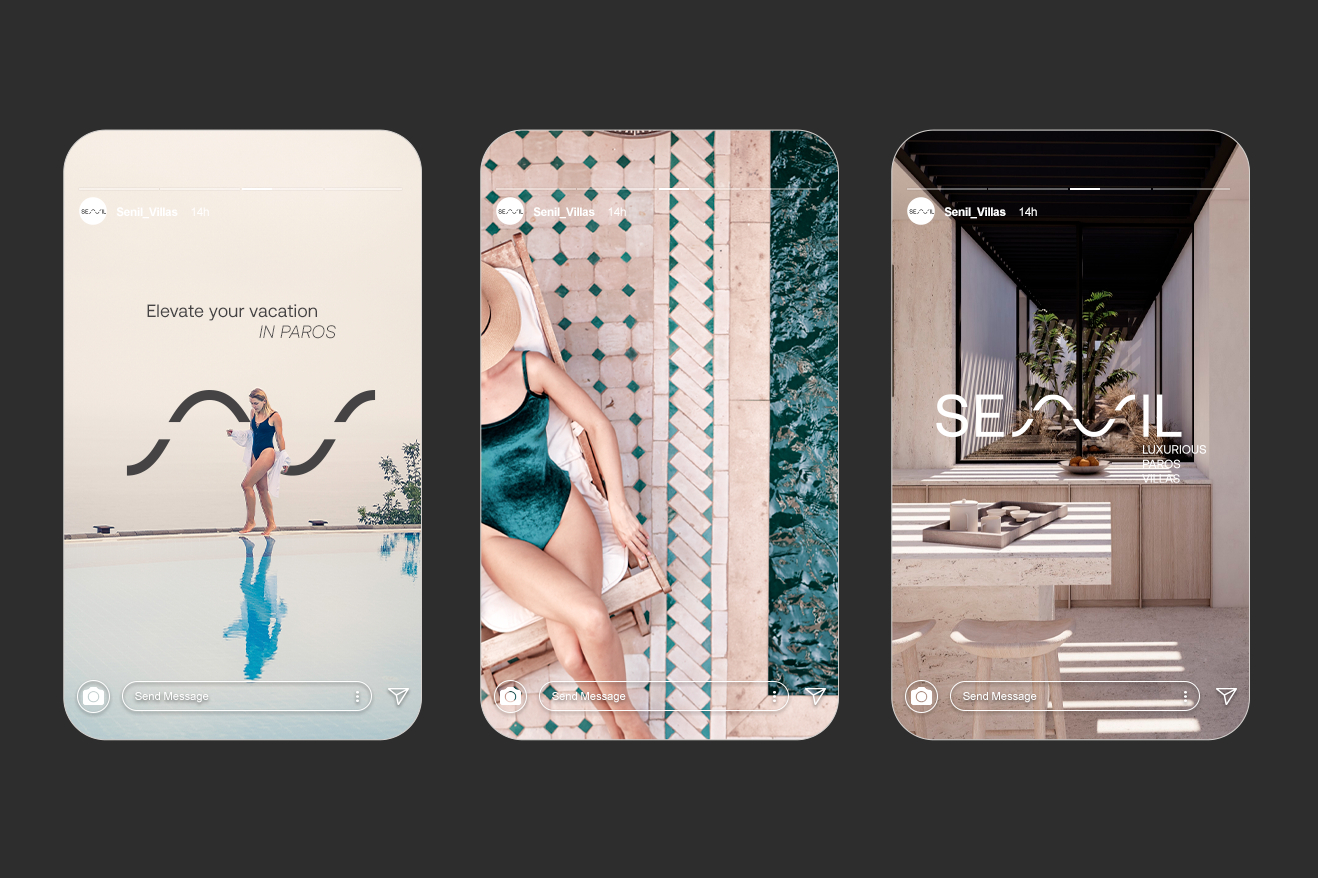
From the printed materials to digital touchpoints, every interaction is designed to feel like a deep breath. A moment of calm. A subtle encounter with elegance.
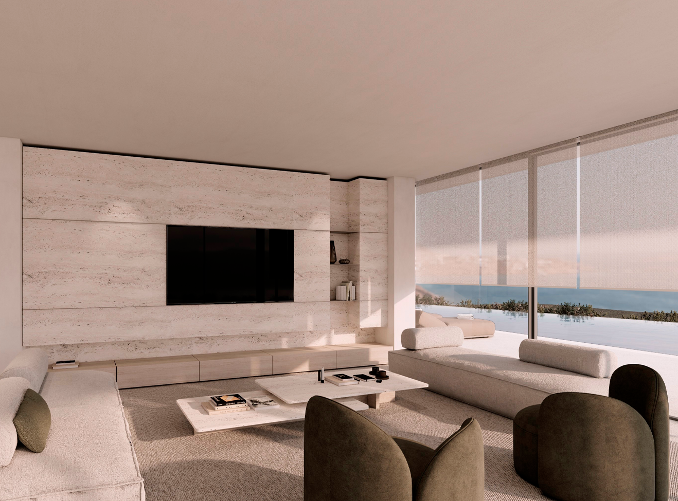
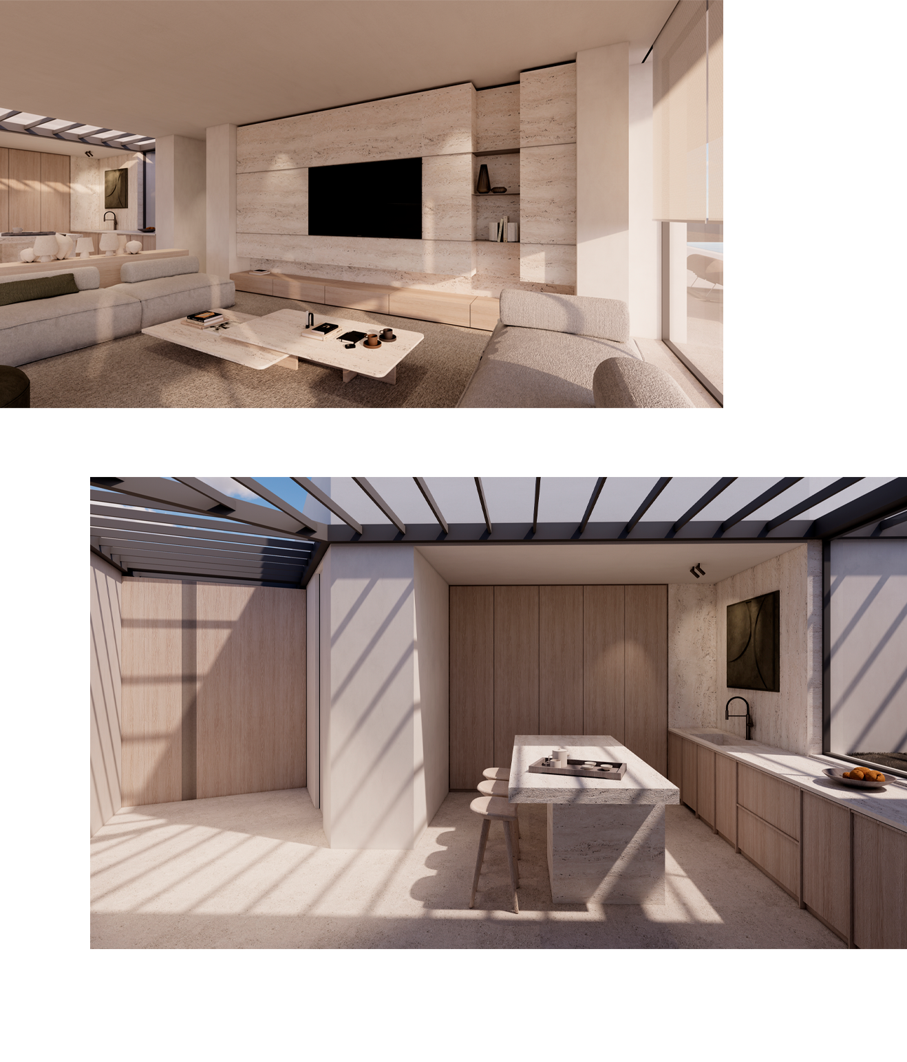
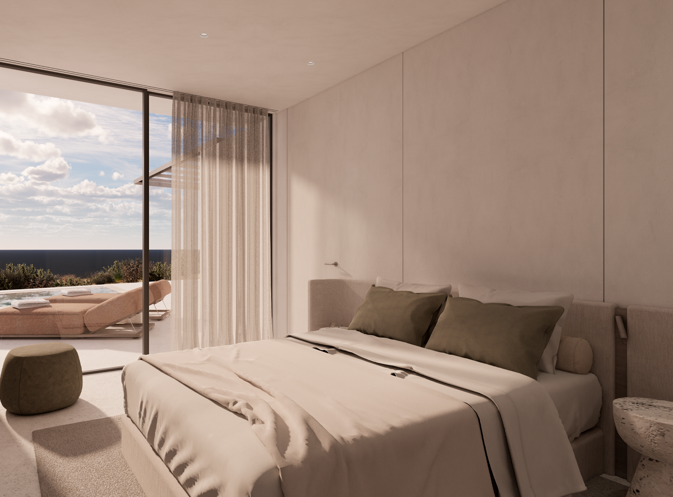
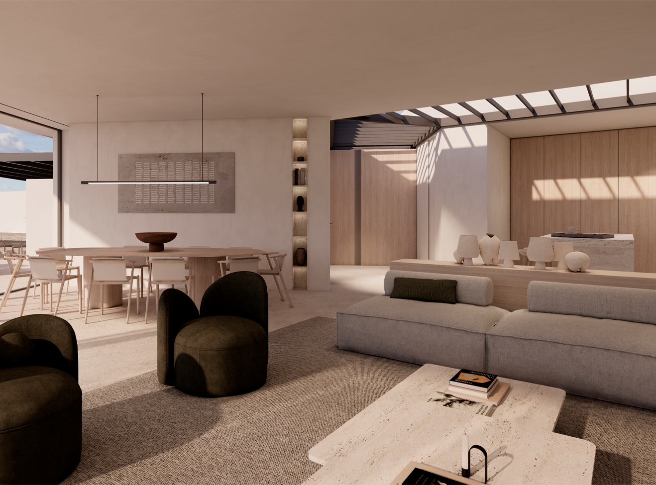
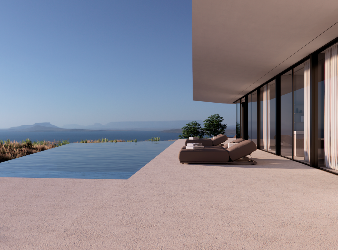
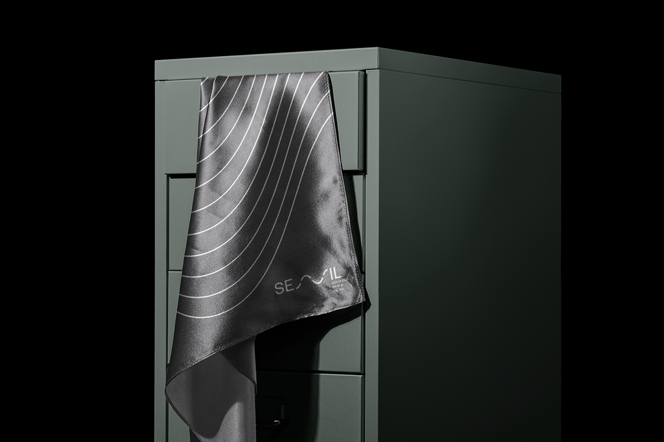
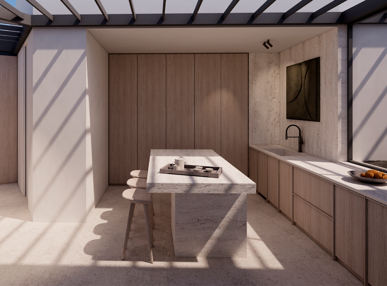
We worked in close synergy with the architectural teams throughout the process, ensuring that the brand identity would not only reflect, but extend, the architectural intent. From the curves of the logo to the rhythm of the lines, the brand became a natural continuation of the design language of the villas. The architecture, the name, the brand personality, and the visual system all speak the same quiet language. Nothing is forced. Everything flows.
