Algohox Fever Reducing Gel is a medical grade roll on gel that helps naturally reduce fever in infants and young children. The product works through a double cooling mechanism that combines heat absorption with natural evaporation, offering fast, safe and effective relief without medication.
The client approached us with a clear objective. To create a packaging and in store presence that communicates trust, safety and effectiveness at a glance. They wanted a design that stands out in pharmacies, speaks directly to parents and highlights the product’s unique benefits in a friendly yet professional way.
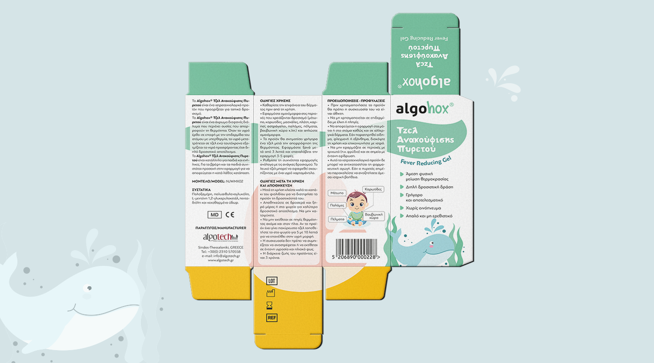
Shaping the concept
Our concept was built on one central insight. When it comes to fever, parents seek calmness, trust and instant reassurance.
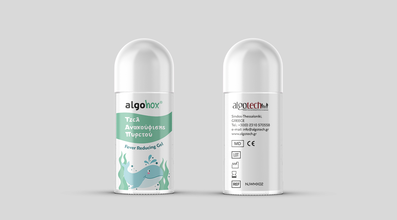
We created a gentle and approachable visual language that blends medical credibility with emotional warmth. The whale was designed as a friendly guardian, a symbol of care, softness and protection.
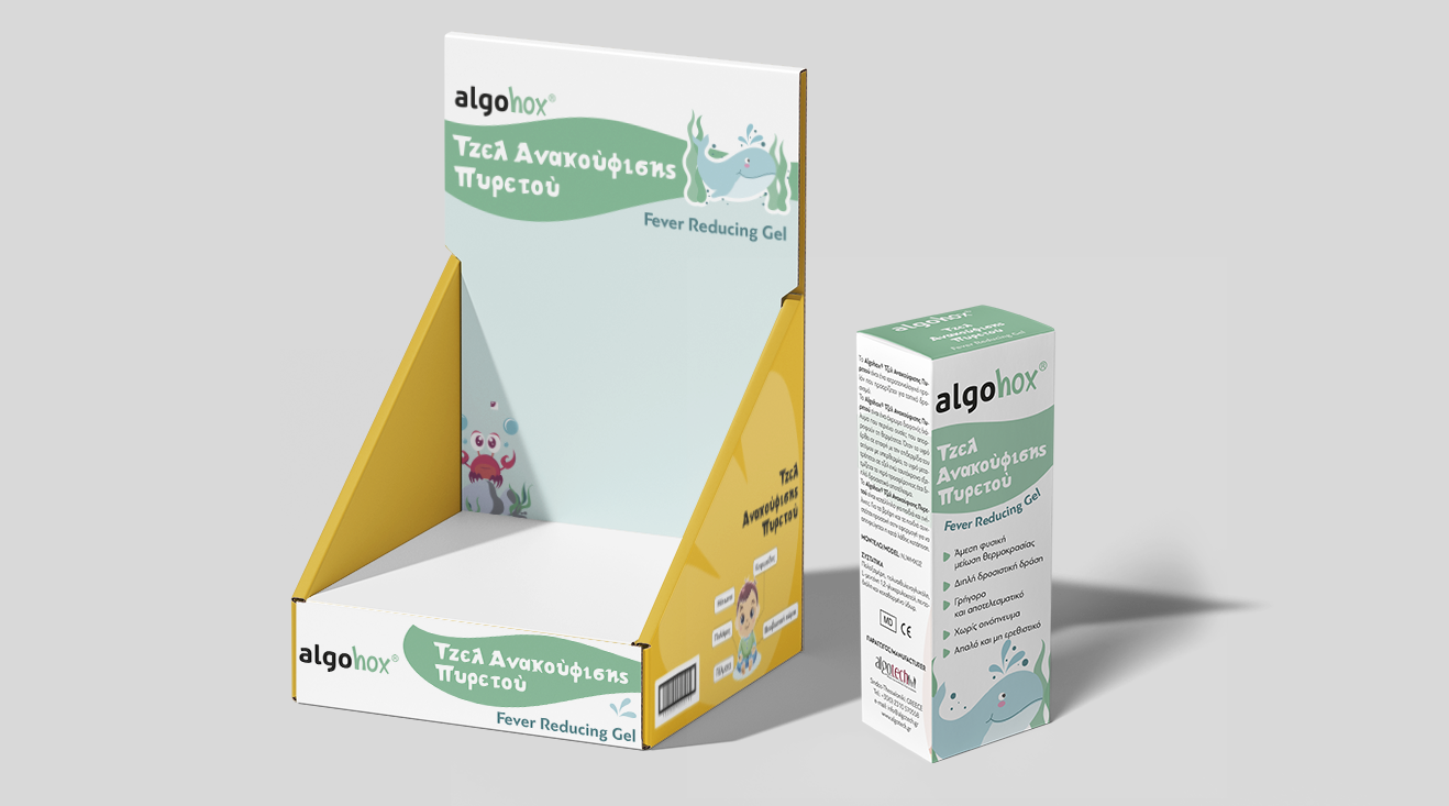
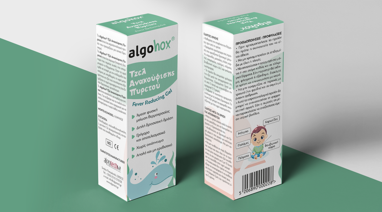
Clean typography, soft green tones and minimal structure were combined to communicate the cooling effect and medical trustworthiness, highlight the key product benefits clearly and ensure strong visibility both on shelf and in the hands of parents.
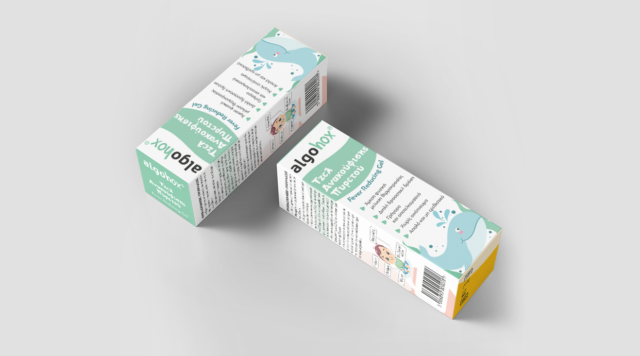
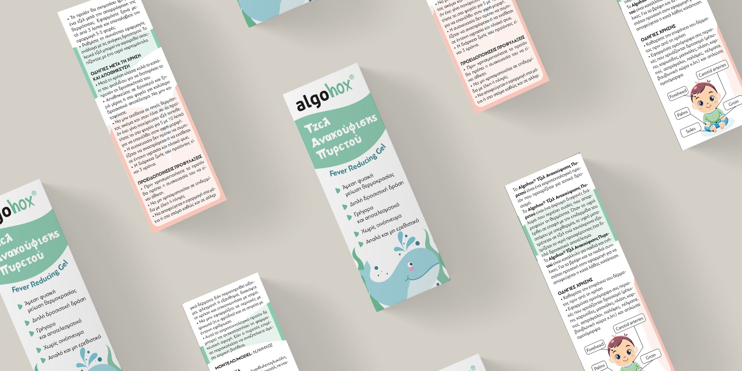
From strategy to shelf
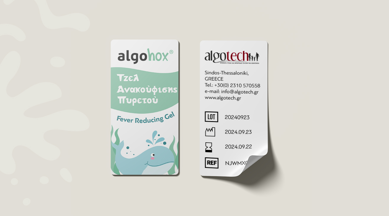
Our work focused on building a coherent packaging system that includes primary packaging, the in store stand and clear product messaging. Every element was crafted to deliver clarity, reassurance and differentiation in a competitive OTC environment.
By aligning product strategy, design and retail presentation we helped Algohox launch with a packaging identity that builds trust with parents and pharmacists, amplifies product benefits through design and creates a consistent in store experience with strong shelf impact.
