
SPERMOGENE is a next-generation andrology laboratory that provides testing services for the diagnosis, and prevention of all issues related to the male reproductive system, utilizing the latest in modern technology.
Our collaboration began not with design, but with strategy. By defining the brand’s positioning, target audience, and unique value proposition, we set the foundation for an identity system that communicates trust, expertise, and innovation in the sensitive field of male fertility.

The idea behind the logo
The logo combines three powerful elements into one visual statement: the sperm symbol, the letter “O,” and the male symbol. The result is a distinctive mark that communicates both the scientific essence of the brand and its human focus. The sperm becomes a dynamic element in motion, embedded in the “O,” which transforms into the universal male symbol, an immediate connection to the brand’s mission.


The Typeface & Colors
The typeface we selected for Spermogene is clean, modern, and assertive. Its geometric precision reflects the scientific foundation of the brand, while its bold structure conveys trust and authority, qualities essential in the field of male fertility.
The clarity of the letterforms ensures readability across all touchpoints, from digital screens to printed materials, while the solid, contemporary style creates a sense of confidence and professionalism.
The color palette builds on trust and professionalism:
- Primary Dark Blue evokes stability, authority, and medical expertise.
- Primary Light Blue adds freshness, clarity, and approachability.
- Secondary Light Grey and Off White provide balance and neutrality, allowing the core brand elements to stand out.
Together, the typeface and colors ensure that Spermogene feels both scientific and accessible.



The Challenge
Balancing science and humanity
Male fertility is a subject often surrounded by stigma and hesitation. The challenge was to create a brand identity that balances scientific credibility with approachability. It needed to feel professional and reliable, but at the same time human and empathetic. Our task was to design an identity that would empower men to engage with their fertility health openly, while presenting Spermogene as a next-generation medical expert.




Design core
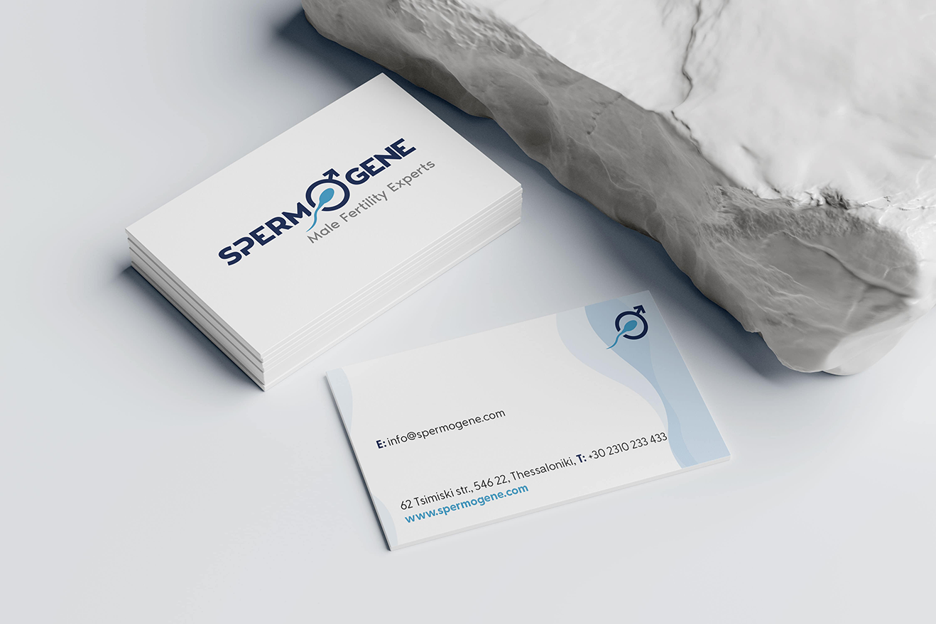
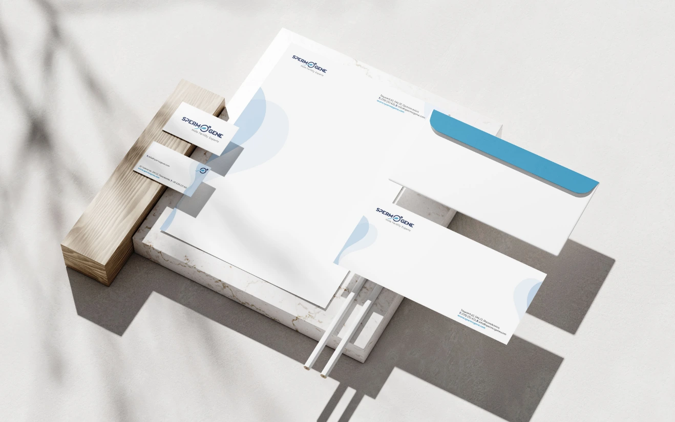
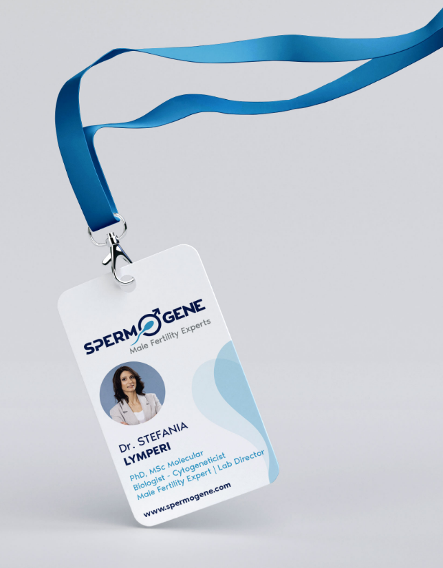
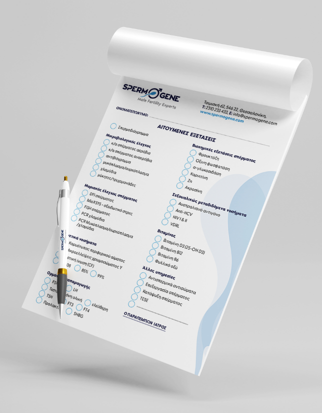
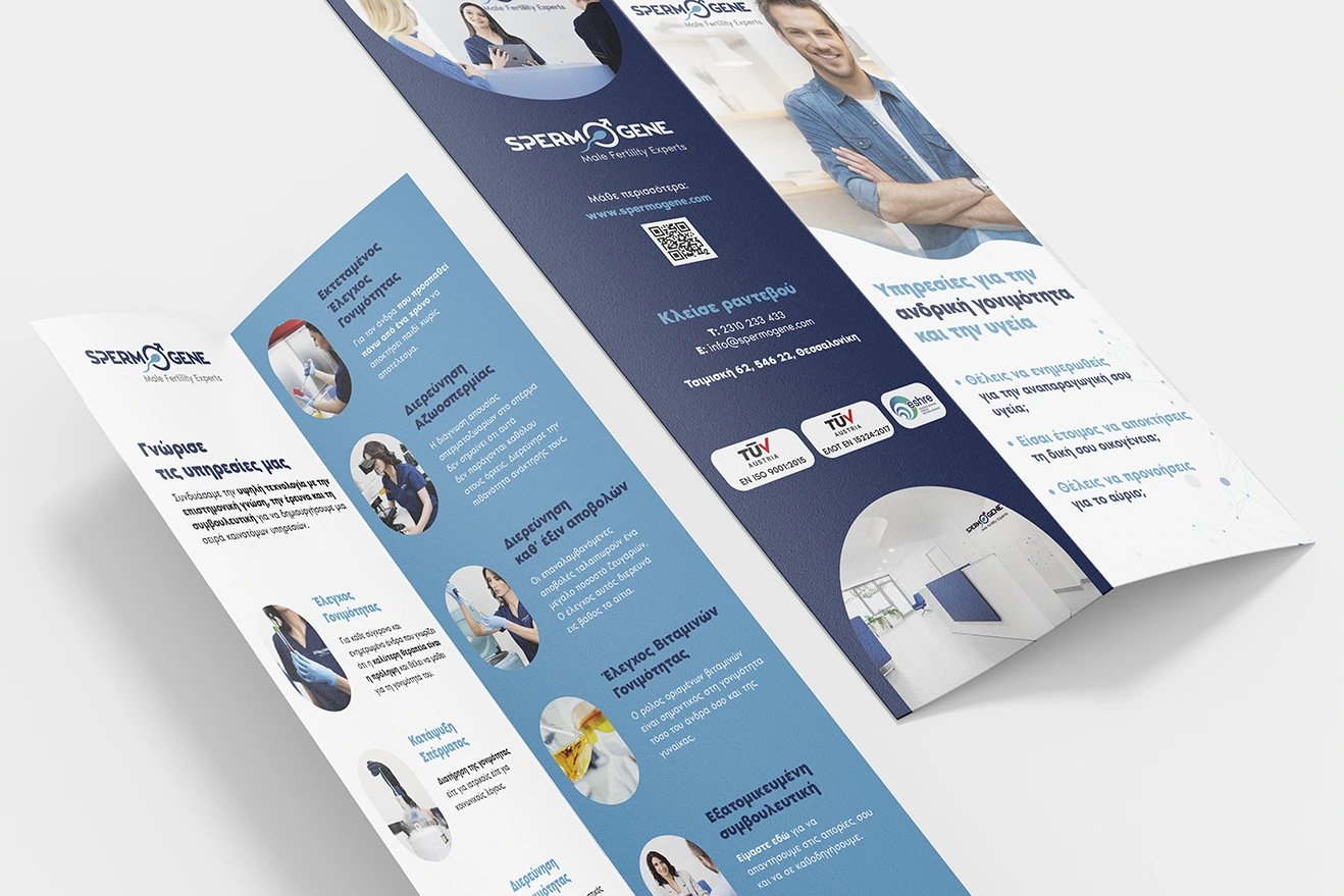
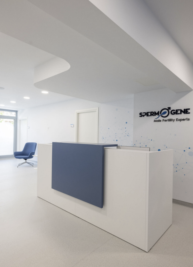
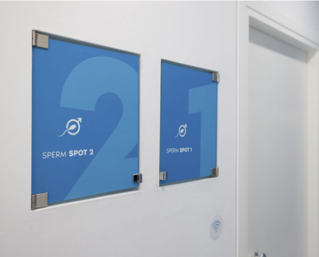
The visual identity was extended across all touchpoints, print, digital, spatial, and environmental branding. From brochures and signage to staff uniforms and interior graphics, every application reflects the same consistent design language.
The core design principle was clarity with impact: clean lines, modern forms, and a visual system that guides patients through their journey with comfort and confidence. Our art direction for the photoshoot further emphasized this philosophy, presenting the brand as approachable and professional, while reinforcing its positioning as “Male Fertility Experts.”
The result is a holistic identity that not only informs but also reassures turning a delicate subject into a confident and empowering brand experience.
