The challenge
Rebranding with purpose
Phytorgan is a Greek company with a long-standing presence in the field of agriculture and crop protection. With a clear strategic vision, the goal was to revitalize its corporate identity to reflect its scientific expertise, commitment to sustainability, and strong partnerships built on trust. The new identity needed to be modern, flexible, and purposeful.
Η προσέγγισή μας
Strategy before design
At RISTART, we always start with strategy. Before any creative concept is designed, we dive deep into the core of the brand. This approach allows us to build identities that not only stand out visually but also communicate with clarity and consistency.
Key steps:
- Brand and market analysis
- Competitive landscape mapping
- Audience needs and insights
- Positioning strategy development
- Storytelling and messaging pillars
- Tagline creation that expresses the brand’s essence
Brand Storytelling
From insight to narrative
To build a narrative with real substance, we began with in-depth research. We conducted interviews and workshops with the company’s team to understand its culture, values, and vision from the inside. At the same time, we spoke with customers and partners to capture how they perceive the brand and what aspects of their relationship matter most.
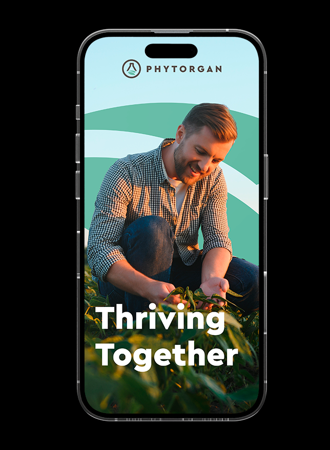
We consolidated the insights, analyzed the findings, and crafted a cohesive brand narrative that reflects the true core of Phytorgan. From this strategic foundation, the tagline Thriving Together was born.
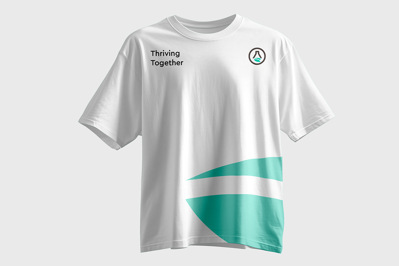
The storytelling of Phytorgan was inspired by the company’s core connection with growers, partners, and the land itself. The tagline “Thriving Together” captures its philosophy:
Growth through collaboration and a shared vision.
Messaging Pillars:
• Collaboration and trust
• Scientific expertise and innovation
• Sustainability and environmental respect
• Growth with a shared purpose
Design System
When strategy shapes the visual language
Based on the identity and messaging defined in the previous stages, we developed a comprehensive visual system that articulates the company’s essence with clarity and precision.
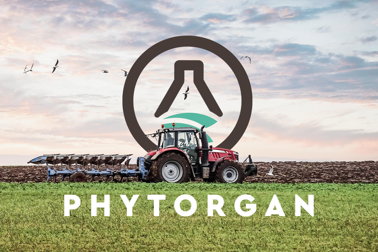
The logotype was conceived as a symbol of balance between science and nature. Its clean, geometric lines reflect precision, expertise, and technical rigor, while its organic curves introduce a sense of vitality, growth, and connection to the land. The outcome is a mark that is distinctive, adaptable, and instantly recognizable across all scales and formats.
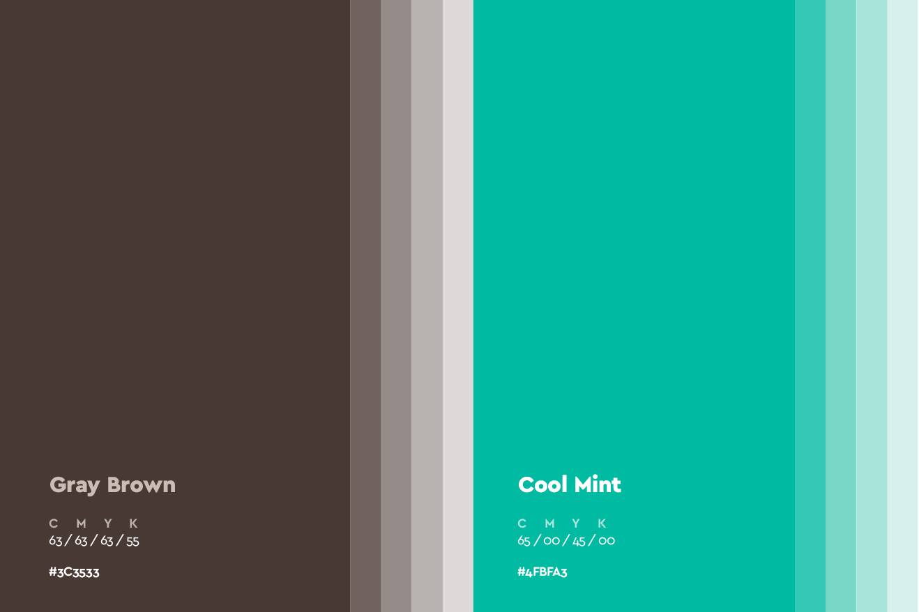
The color palette was carefully designed to bridge the company’s scientific profile with a sense of natural trustworthiness. Earthy and green tones express its environmental commitment, while clean neutral shades serve as a stable foundation that conveys reliability and professionalism. This is not a decorative decision but a deliberate way to express the dual character of Phytorgan in every touchpoint.
Typography plays a crucial role in this system. We selected modern typefaces with strong structure and clean lines to reflect clarity and scientific rigor, while maintaining a human tone. The typographic hierarchy was designed to ensure a professional, legible, and elegant communication style across all channels.

A brand that lives across every touchpoint
The visual system is completed with a modular grid built to provide both flexibility and consistency across print and digital environments. The branding logic is structured and rhythmic, allowing the identity to adapt fluidly whether on a small digital banner or a large-scale corporate format. It is a visual language with a strong strategic backbone not defined by the medium, but elevated through it.
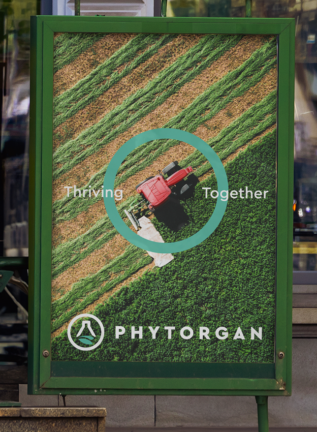
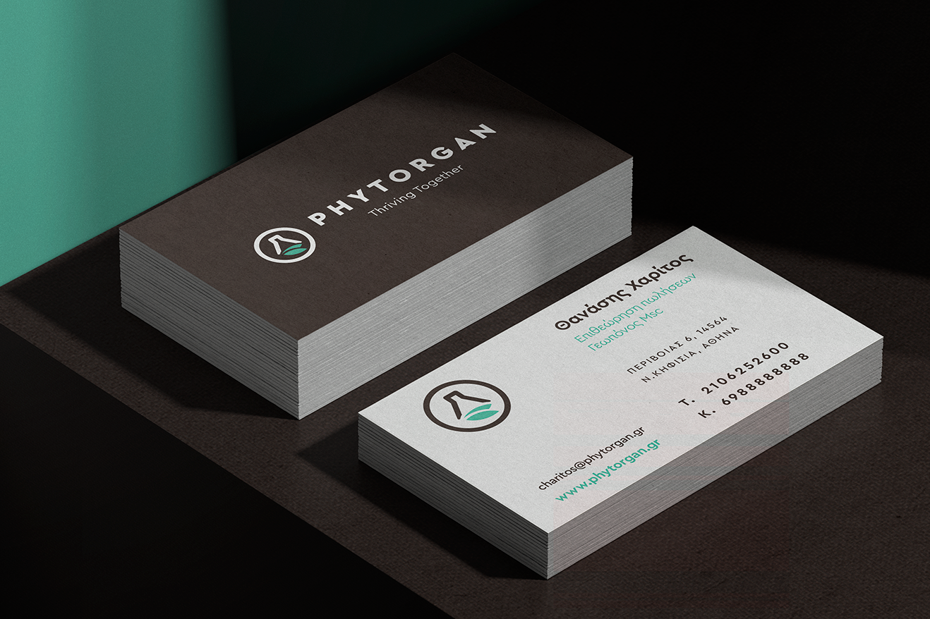
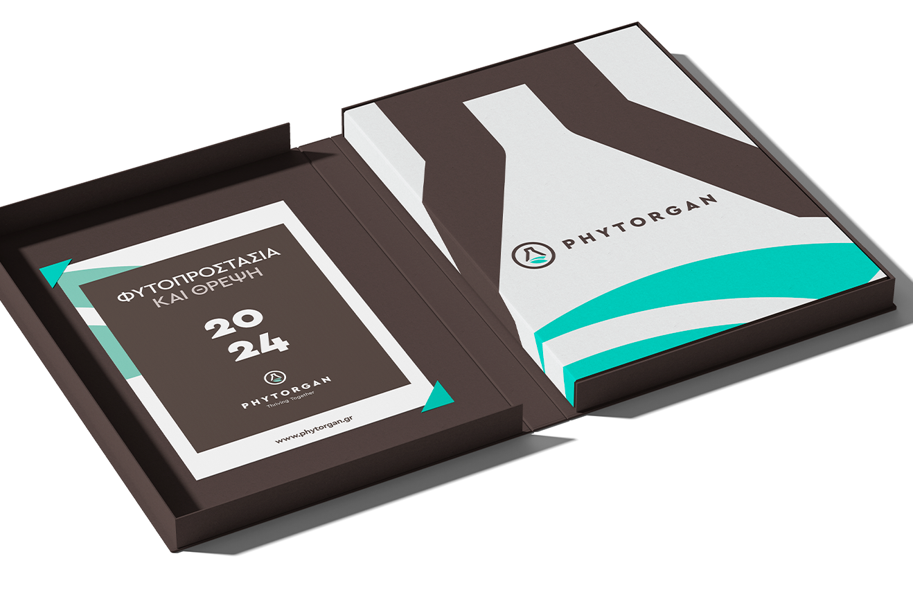
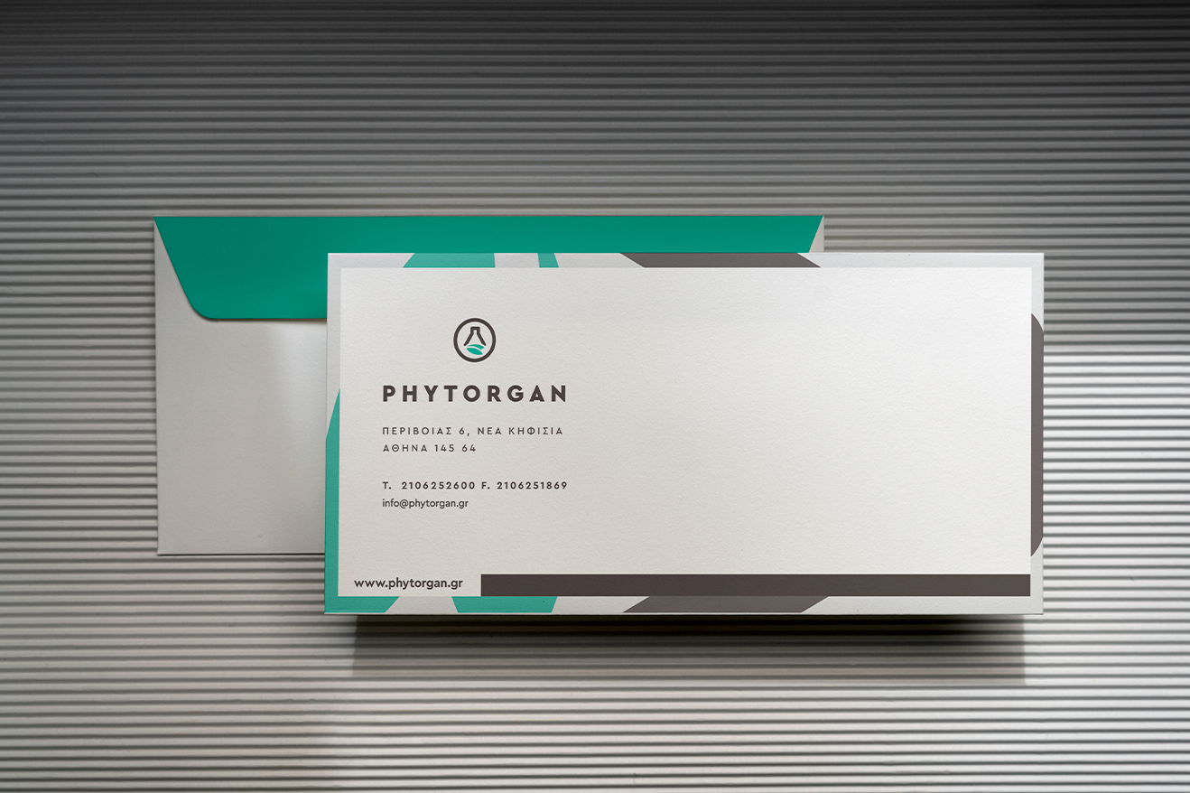
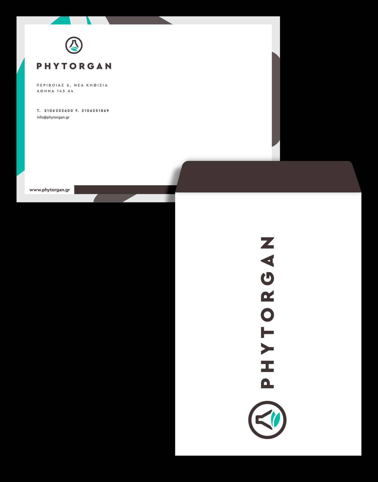
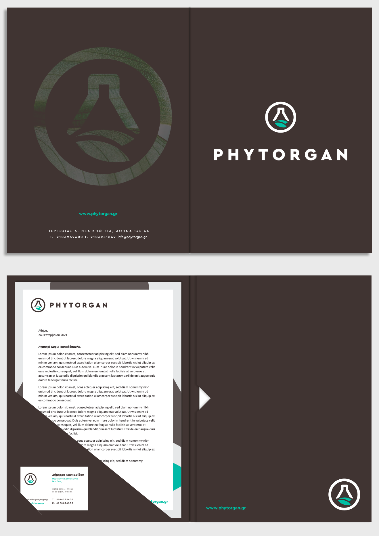
The new identity was rolled out across every touchpoint, delivering consistency and impact. Each application reinforces the company’s positioning and creates a cohesive brand experience.
Εφαρμογές:
• Corporate materials and communication assets
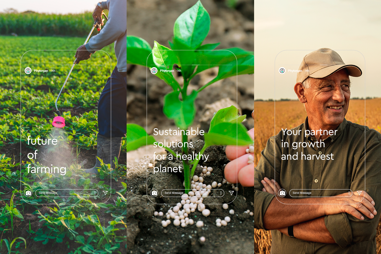
• Digital and social media presence
• Packaging and signage
• Promotional activities and campaigns
