Bringing clarity, confidence, and modernity to financial services.
Taxcess is a bold reimagining of what a modern accounting brand can be. In an industry often associated with complexity and formality, our goal was to create a brand that feels accessible, smart, and forward-thinking, without losing its sense of precision and professionalism.
From naming to full identity design, every element was crafted to inspire trust and communicate a new kind of financial partner: human, modern, and result-driven.
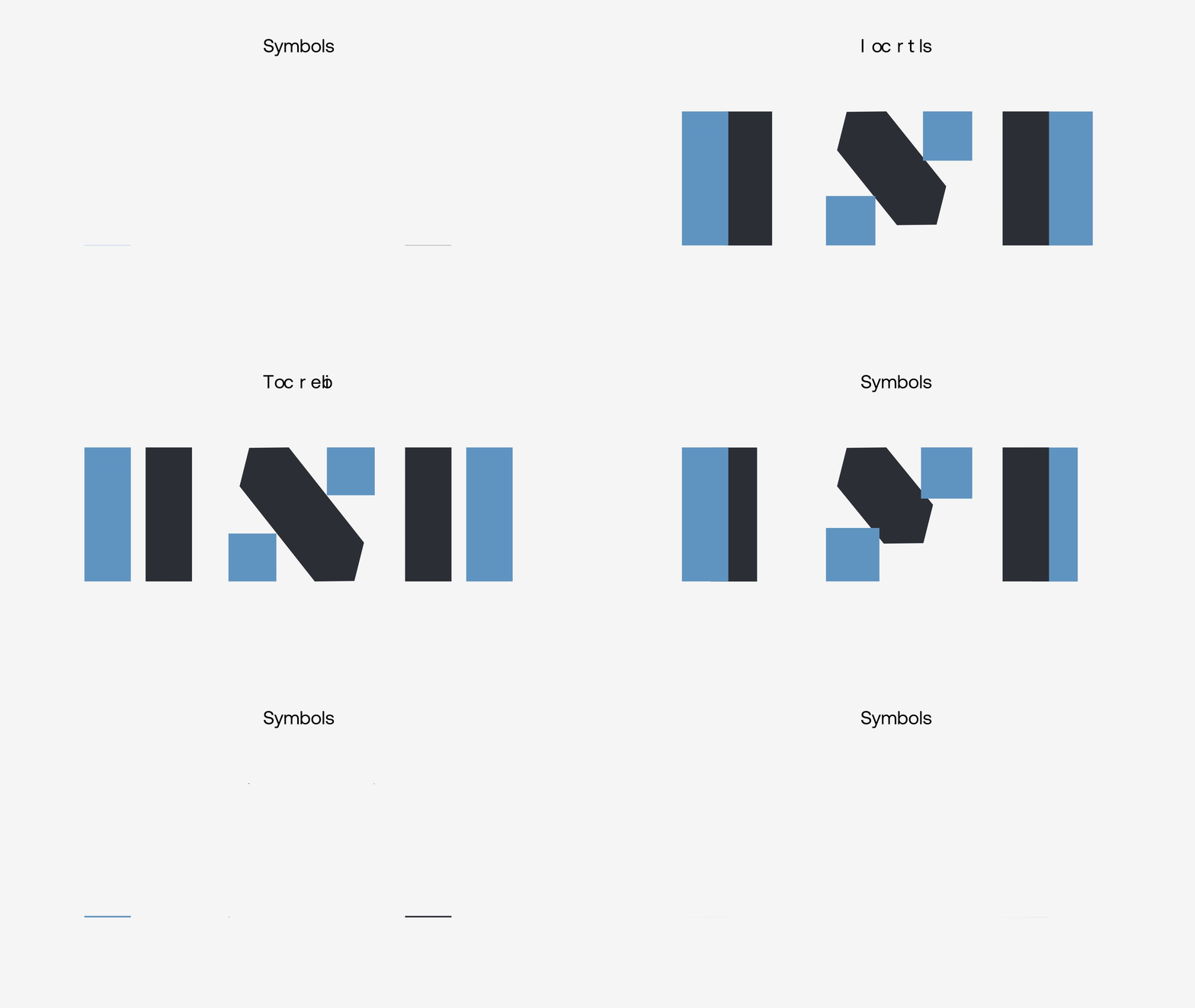
Naming
Tax + Success = Taxcess
A name that tells the story before the pitch begins.
The name Taxcess was born from a simple but powerful blend: the words tax and success.
It speaks to both the nature of the business and the ambition of its clients. Easy to pronounce, internationally comprehensible, and inherently meaningful, the name strikes a balance between professional and approachable. It is a name that promises more than just tax services, it promises outcomes.
The right name builds expectation. Taxcess builds success into its very core.

Visual Identity Design
Bold minimalism with a strategic twist
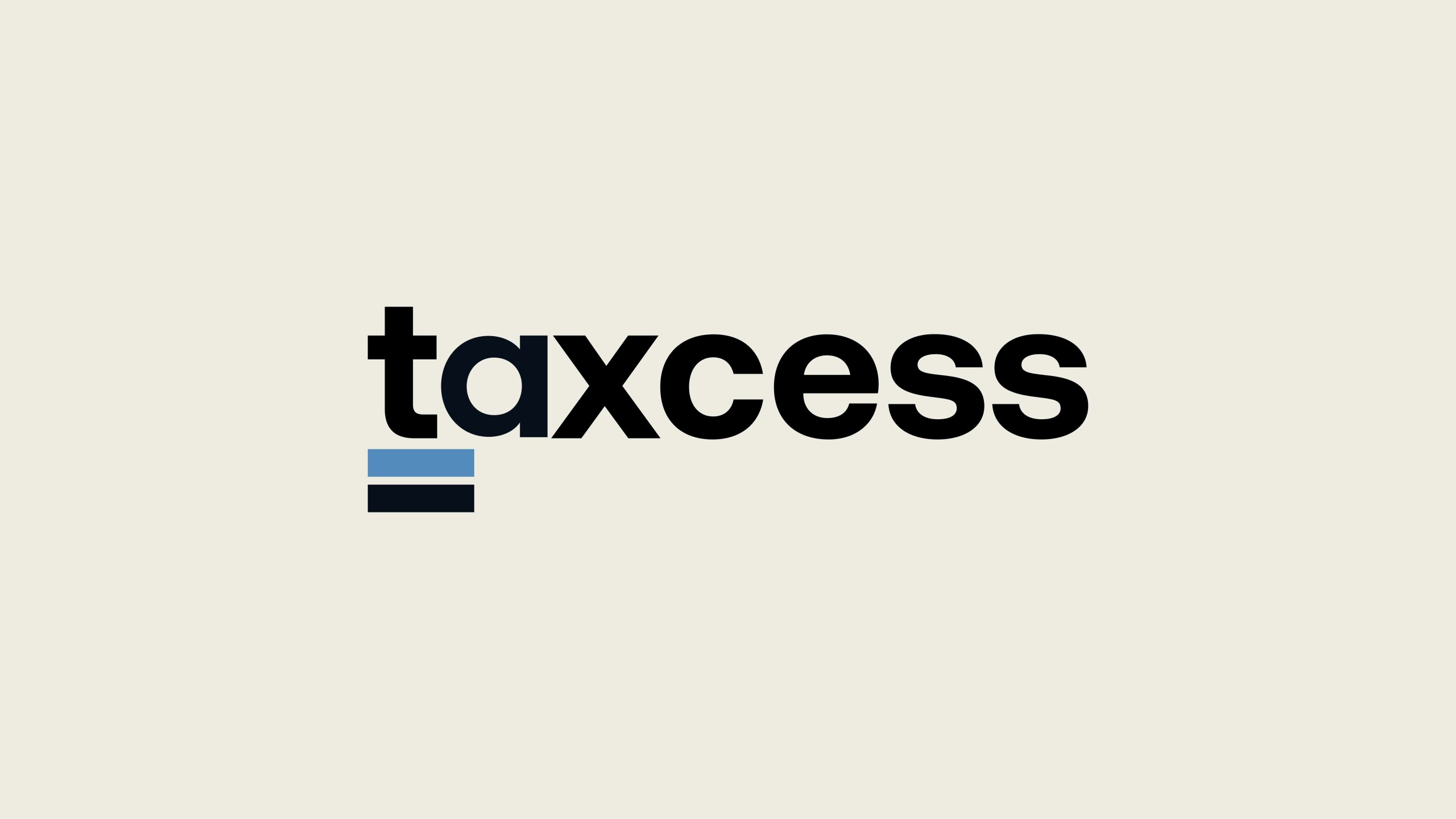
The logo design draws on modernist typographic principles with a custom-crafted wordmark. The visual emphasis on the prefix “tax” grounds the identity, while the smooth transition into “cess” (from success) allows the brand to feel contemporary and cohesive.
A signature element, the double underline, is used as a supporting symbol throughout the system. Representing clarity, foundation, and precision, it becomes a unique visual device across both static and animated formats.
Typography & Color System
Designing consistency, building recognition.
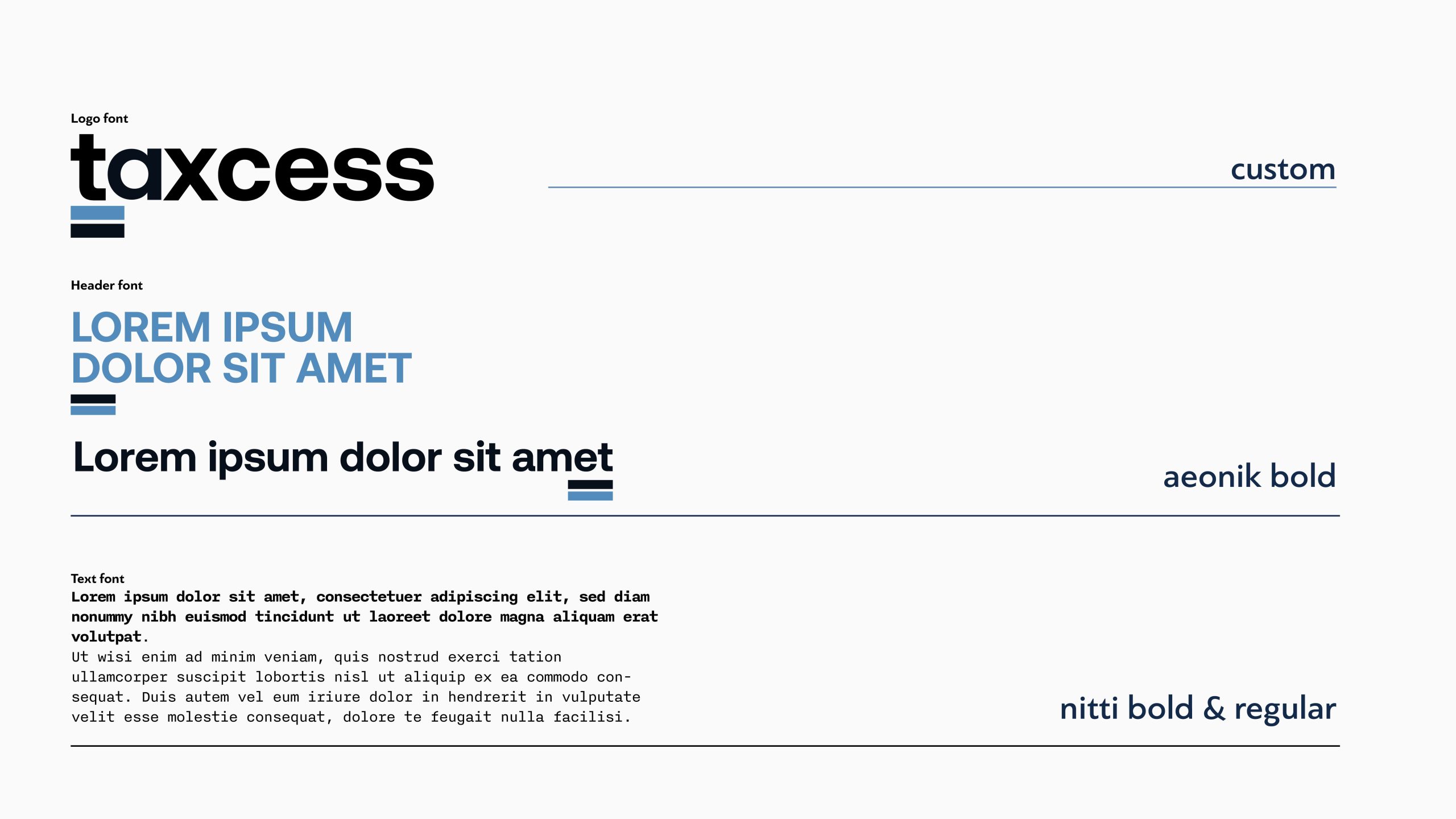
Typography plays a central role in the Taxcess identity, striking a deliberate balance between precision and approachability. The logotype was based on a custom sans-serif design, crafted to ensure visual harmony between the rigid structure of “tax” and the smoother, more open forms of “cess”. This custom type treatment creates a distinctive wordmark that is both modern and timeless, instantly recognizable, yet free of visual noise.
For headers and key messaging, we selected Aeonik Bold, a geometric grotesque typeface known for its clarity, character, and contemporary tone. It adds visual weight where needed, while maintaining a consistent rhythm across titles and callouts. Complementing this, body text is set in Nitti, a monospaced typeface that subtly evokes the idea of order, structure, and trust, all values essential in the financial sector. The interplay between Aeonik and Nitti creates a layered typographic system that communicates confidence without excess.
Brand in Application
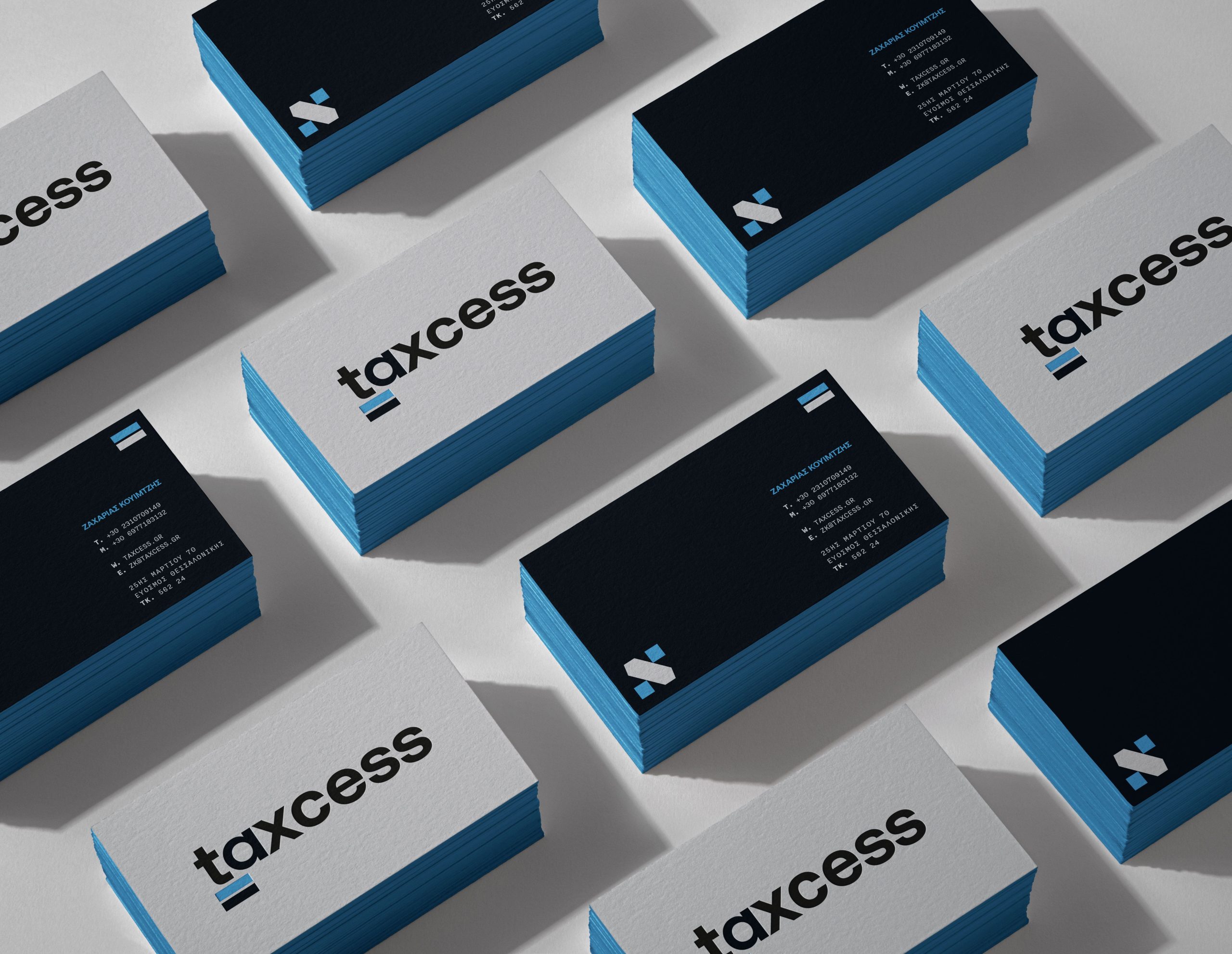
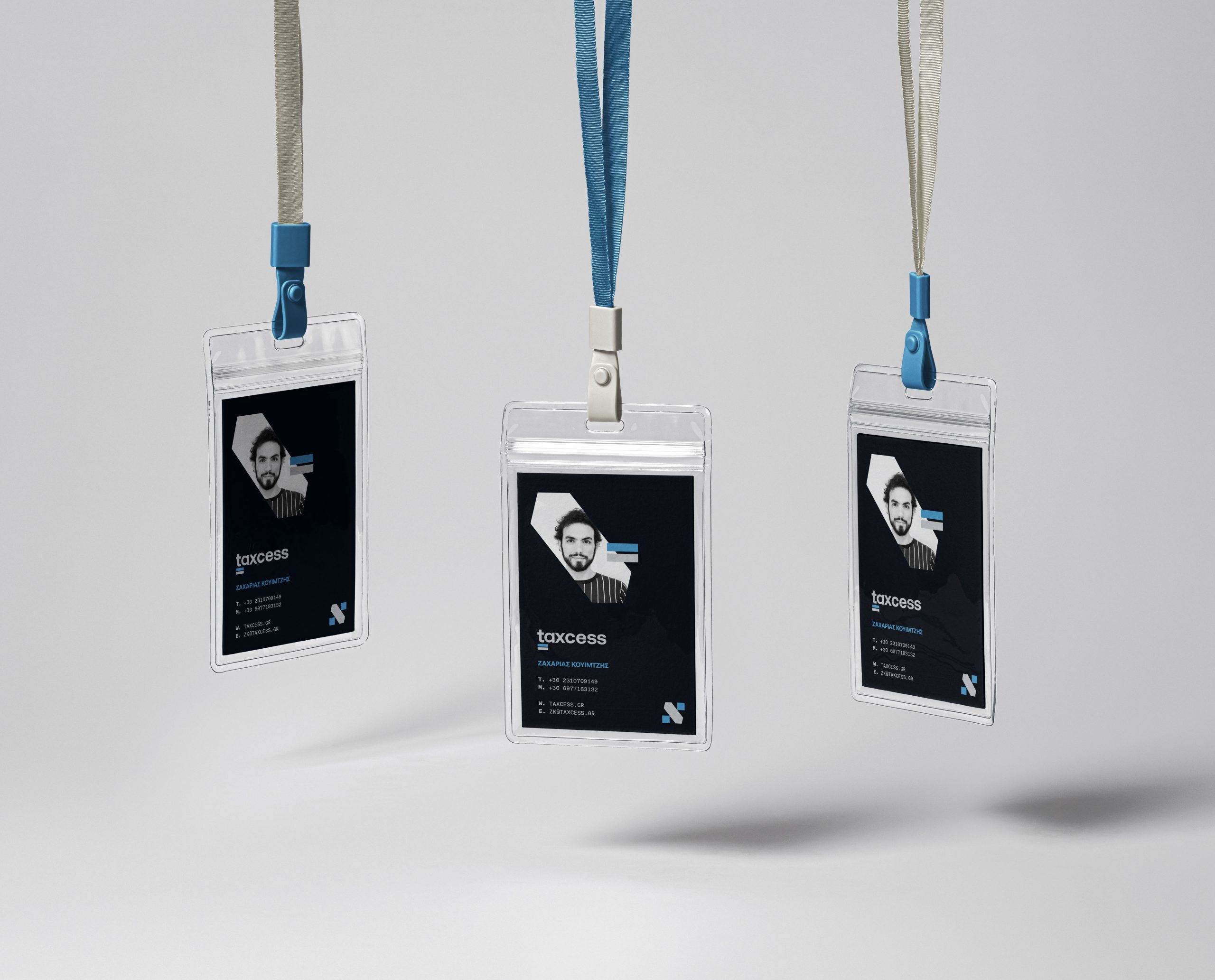
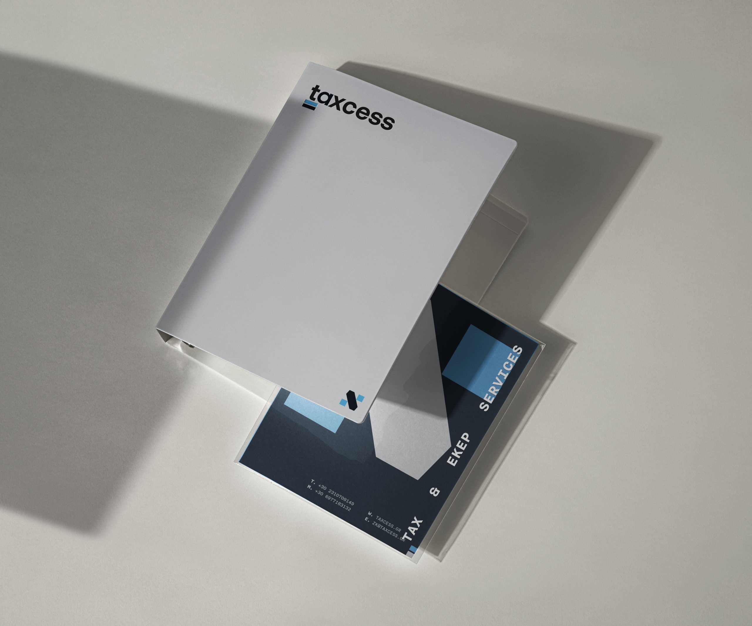
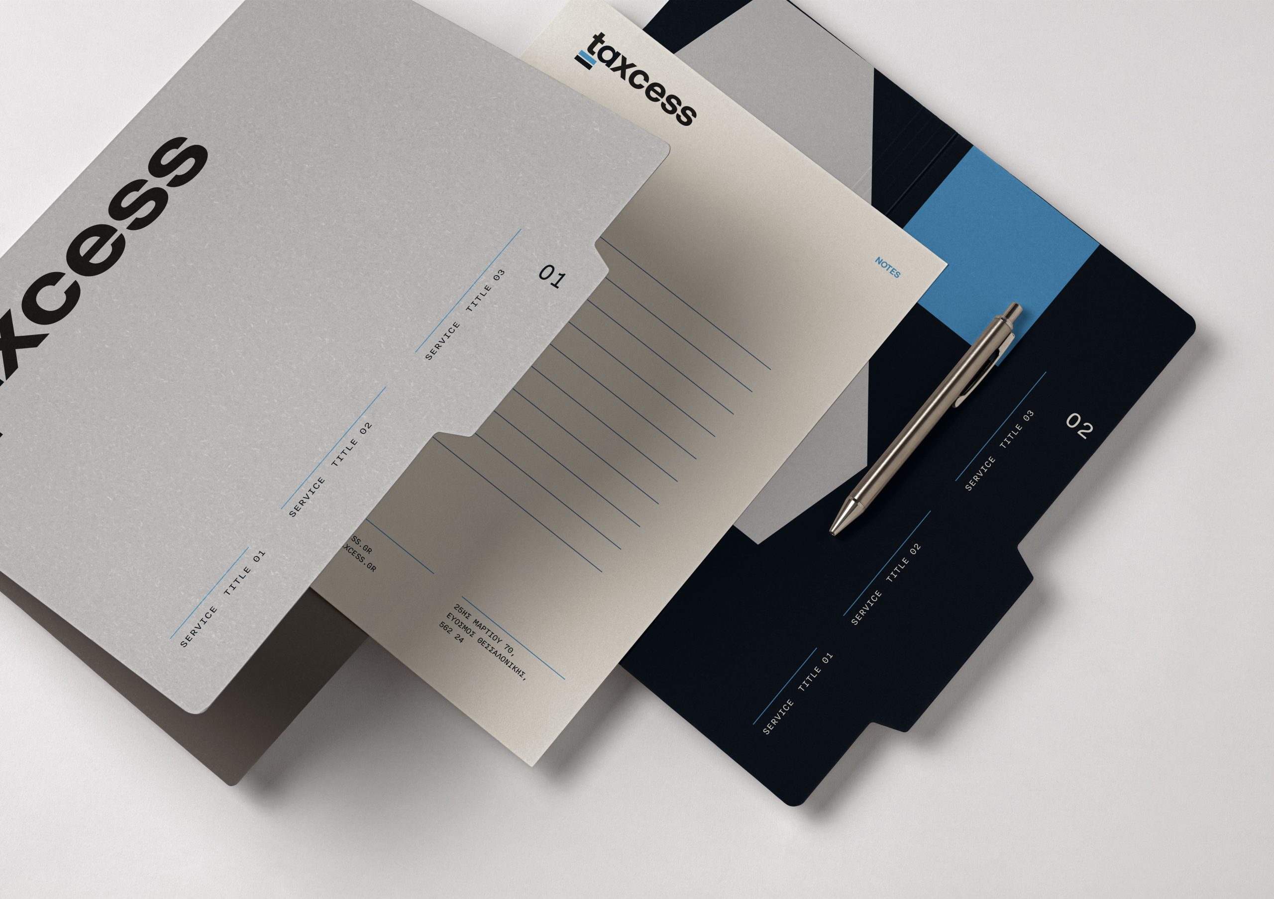
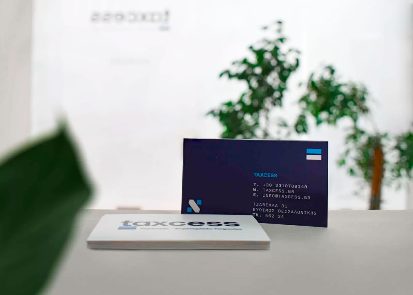
From business cards to branded folders, every touchpoint was designed to reflect the brand’s promise: smart solutions with clarity and style. A motion element was introduced to breathe life into the system and bring a dynamic layer to digital formats, allowing the brand to move with the times, quite literally.
We designed a coherent yet flexible system that can scale across channels, ensuring Taxcess looks and feels the same, whether it’s in a printed document, a mobile screen, or a presentation pitch.
